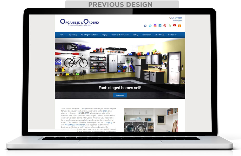
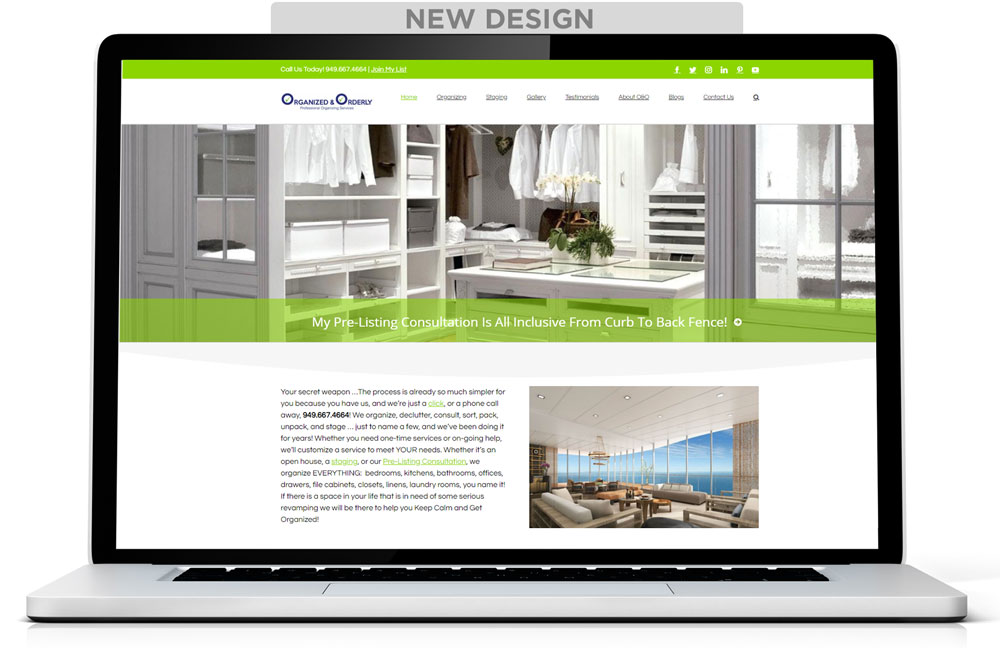
It had been several years since Kirsten Ranger of Organized & Orderly had updated her website and software. Since 48% of people cited a website’s design as the number one factor in deciding the credibility of a business, our mission was clear. We needed to bring this design expert’s website up-to-date with the same professional image that she left any home staging or redesign project she touched.
The initial analysis of Kirsten’s site saw the average factors that you would find on a site that hadn’t been updated for years. The layout designs were out of style, plugins needed updating, new features were available, and a backlog of images were waiting from her most recent projects. After starting on the project, we found that elements of her previous design hurt her rankings on Google as well. We had to fix that.
New Website Layout With A Full Width, Responsive WordPress Theme
The advent of HTML5 and CSS3 and the need for websites to adjust to different screen sizes resulted in eye-catching results for websites everywhere. Notably, was the trend that brought fixed-width sites to full-width websites. With this website redesign, it was time to catch Organized & Orderly up with the mobile-friendly times. In order to do that, we needed a theme that had the option of full-width and responded with every screen display size.
The theme we chose for KeepCalmKeepOrganized.com is one of our favorite and most used WordPress themes, Avada. Avada enabled us to make a clean website, front-end, and back-end, with great site speed and excellent features. Since the theme is responsive, this ensures that every page on the website would display perfectly on mobile devices.
Updating WordPress Plugins
Anyone WordPress site owner is familiar with the blaring notifications of outdated plugins. Updating your plugins is incredibly important for a few reasons.
Plugin updates might mean new features. It could also be necessary to keep up with a WordPress update. Most importantly, a plugin update might fix a vulnerability that might open up your site to hackers and malware.
Luckily, Organized & Orderly’s website didn’t have a lot of outdated plugins except for one culprit. The photo gallery software had been discontinued years prior. With this plugin, the photos of Organized & Orderly’s beautiful home organizing photos were unorganized and minimized. On occasion, images or certain pages in the gallery broke completely.
Many features are part of the Avada theme and its Fusion Builder editor as opposed to a separate plugin. This included the much-needed gallery update that Organized & Orderly required.
New Features
Since highlighting Organized & Orderly’s work in photos is the most important way to portray their work, it was important that the new features did just that.
 Photo Gallery
The much-needed photo gallery brought new features that highlighted Organized & Orderly’s work. Now, thumbnails were more visible. And, when clicked, an interactive gallery opens with a slideshow, zooming effects, manual scrolling and sharing options. Plus, the back end of the photo gallery is now easy to use with bulk uploading and customizations.
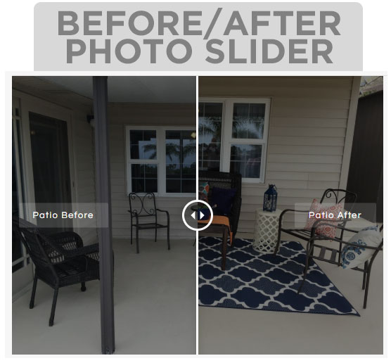
View An Active Before/After Photo Slider At The Top Of This Page
Before and After Photo Slider Display
One of the reasons that we choose the Avada theme for this project was the inclusion of an image Before and After element. This allowed us to display Organized & Orderly’s before and after photos side-by-side with an interactive slider so visitors easily transition between each photo.
Image Carousels and Sliders
Carrying on with the needs to encourage good photo engagement, we installed smooth image carousels and sliders to showcase their work flawlessly.
Optimizing Images for Search Engines
One of the biggest challenges we faced with this website redesign was the poor file naming from the outdated gallery plugin. The website had hundreds of photos on it. However, due to the previous photo gallery, files were named with random numbers (ex: 123456.jpg). Images were also missing ALT TAGS.
Google wants to know what an image is without looking at it. So the previous gallery’s image naming was a poor SEO practice. None of the images had ALT TAGS assigned to them furthering the problem. For the redesign, we changed each image name appropriately (ex: kitchen-drawer-organized.jpg) and tagged with the proper ALT TAG.
The Result? A Faster, More User-Friendly Website Redesign
Now, Organized & Orderly’s website reflects the quality of their luxury organizing and staging services. Site visitors can easily browse through their work with easy navigation, a faster site, and interactive features.
Behind the scenes, the new features are already giving the website an advantage. The back end has easy-to-use editing features so that team members can jump on to their site to manage different areas of the site. Images are now search engine friendly. And to top it off, up-to-date software managed by Marketing Magnitude.
If your website needs to be updated and you would like information on a website redesign, we can help! Marketing Magnitude owner, Kelly Rossi, has been in the web development industry for over 20 years and will personally oversee your project. Call 702.482.8529 to begin.
